
Screen Printing: Inks and Color Mixing
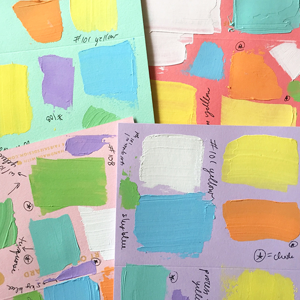
Before I start to print any of my projects, I spend a lot of time mixing colors. I love to experiment with different color combinations. I'm not super precise about my color formulas. I prefer to mix unique color palettes that slightly vary instead of measuring out exact ink amounts. I think of my prints as a painting, and I use the same color theory that I would use if I were applying paint with a brush.

One thing I'm always looking at is the balance of warm and cool colors in a print. Basically, warmer colors tend to go towards red, and cooler colors tend to go towards green. I make notes about the color formula next to the color swatches to remember what I used for next time. But if I ever forget to write down a color recipe, I just look at the color and think - is it warm or is it cool? And then I can usually figure out how to mix it again.
The inks I use are essentially acrylic paint, so they aren't toxic and don't give off fumes like oil-based inks. They're also safe for children and the environment, which is a big plus. But unfortunately, water-based inks dry very quickly. So I add a few drops of water to make the ink flow more easily and slow down the drying time. When my ink starts to feel like thick cream, then I know that I've reached the right consistency. Once I have the color and the consistency right, I add the ink to the screen and start printing!


And here's the finished baby chick card! It takes a lot trial and error to get the balance of the colors just right, but seeing everything finally come together is one of the best parts of screen printing.

All images via Christina Livesey.