
Holiday Card Color Schemes
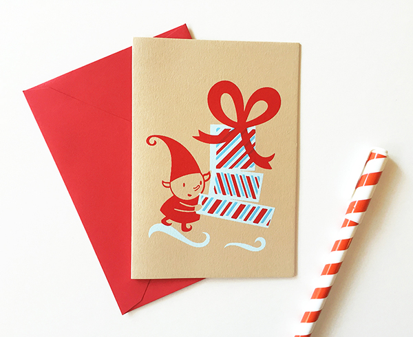
I'm really excited to unveil my new holiday cards. I put a lot of love and care into these mini "Elf" holiday cards. I first started making my elf holiday cards many years ago in a printmaking class at SVA after I graduated from college. They're my favorite characters and I hope to add more to the series as time goes on.

For the "Elf" card color schemes, I chose a warm blue that leans towards purple. The warm blue combined with the bright red are reminiscent of peppermint candy sticks, giving the series a special holiday feel.

Phew! The registration on these tiny cards didn't leave much room for error!

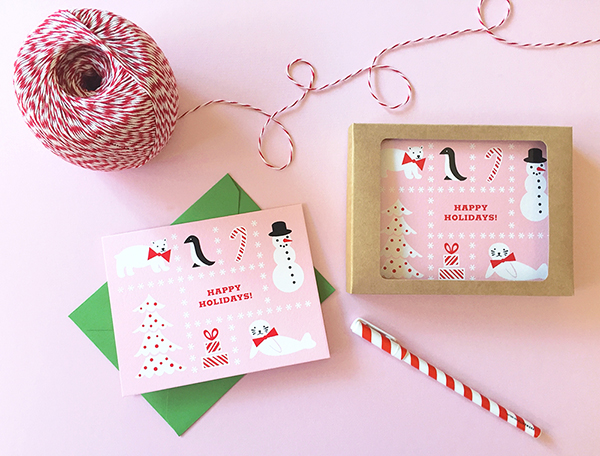
For my "White Seal and Friends" holiday cards, I tried to choose unconventional holiday colors. I also wanted to give customers several paper color options. That way, when sending cards to friends and family, they can pick a different color for each specific person on their list. I finally narrowed the theme down to red, black, and white holiday objects. I created four color ways by printing on pink, mint green, tan, and gray card stock.

Black, red, and mint green has always been one of my favorite color combinations. There is something so 1950's about it. Using a mint blue-green as opposed to the warmer blue-purple in the elf cards certainly gives these cards a cooler feel. It reminds me more of cold, wintry snow.


I really enjoy using minimalist color schemes. That's one of the great things about screen printing : you can choose a very limited color palette and it actually enhances your prints. In terms of colors for screen printing, less is definitely more!

For more photos of my holiday cards, please visit the holiday section in my shop!
Images via Christina Livesey.